Kotak Mutual Funds
Redesign the Mutual Fund Advisor Portal and create a scalable product

Addressing Accessibility Challenges in a Smart Home Solution Mobile App to Meet EU Compliance
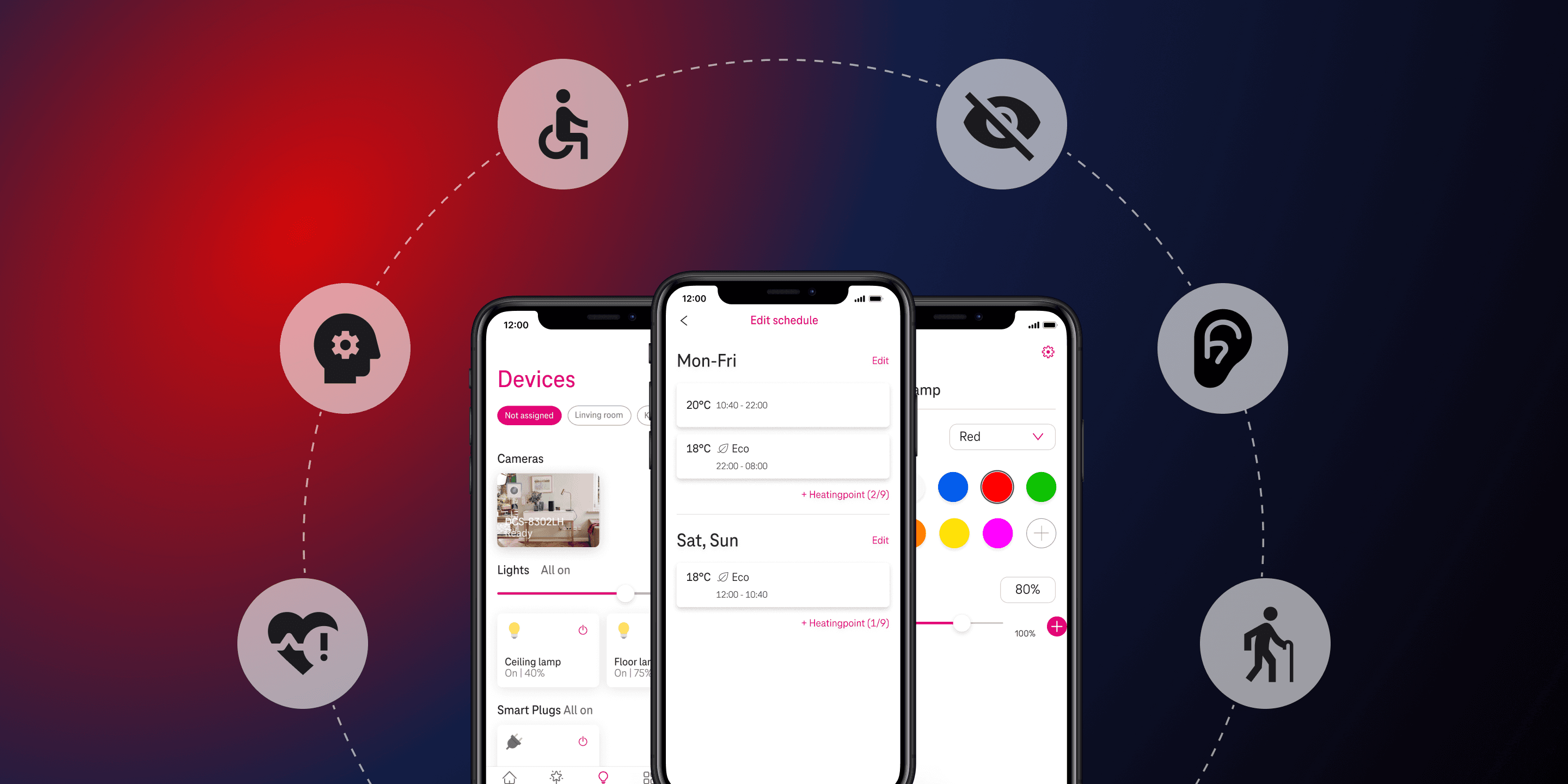
We collaborated on a redesign project with a designer from the MagentaZuhause app, a smart home solution by Deutsche Telekom, after it failed to meet the European Union’s accessibility guidelines during an audit. The audit revealed major accessibility barriers for users with impairments. With a complete overhaul not feasible due to resource limitations, the project focused on targeted redesigns of critical screens and elements to ensure compliance while preserving a seamless experience for all users, including those without disabilities.
UX Research & Design in a team of 2
April 2024 - June 2024 (3 mo)
5 Flows
|40 Unique Screens
What is Web Accessibility?
“Web Accessibility means that websites, tools, and technologies are designed and developed so that people with disabilities can use them.”
W3.org
The Web Content Accessibility Guidelines (WCAG) are a set of guidelines designed to make web content more accessible to people with disabilities. Developed by the World Wide Web Consortium (W3C) through the Web Accessibility Initiative (WAI), these guidelines help ensure that websites are usable by everyone, including those with various impairments.
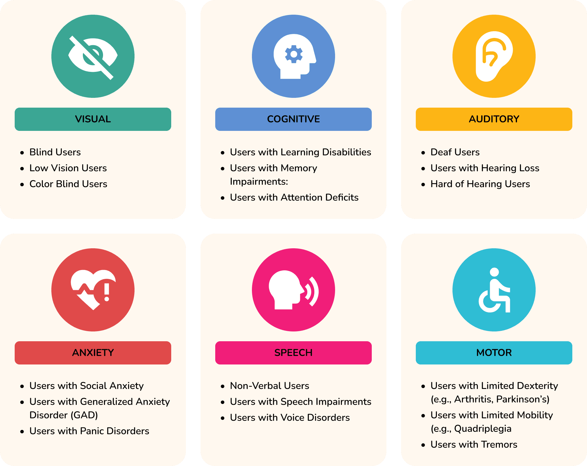
Who are we redesigning for?
Design Goals
Achieve Accessibility Compliance: Ensure the smart home solution mobile application meets the European Union’s accessibility guidelines (WCAG 2.1 AA) to pass future audits.
Enhance User Experience for All: Redesign key elements and screens to provide an inclusive experience for users with disabilities (visual, auditory, motor, cognitive).
Maintain Brand and Functional Integrity: Ensure the redesign of accessible elements aligns with the brand’s existing design language and functionality, avoiding disruption to non-disabled users.
Balancing Compliance and Feasibility
No Complete Redesign: The project must focus on targeted redesigns of screens and elements to address accessibility issues, as a complete overhaul is not feasible due to time and resource constraints.
Time Restrictions: The redesign must be completed within a limited time frame to meet upcoming audit deadlines and regulatory requirements.
Existing Brand Guidelines: The redesign must adhere to the company’s existing brand identity, including visual style, color palettes, and typography.
Design Process Overview
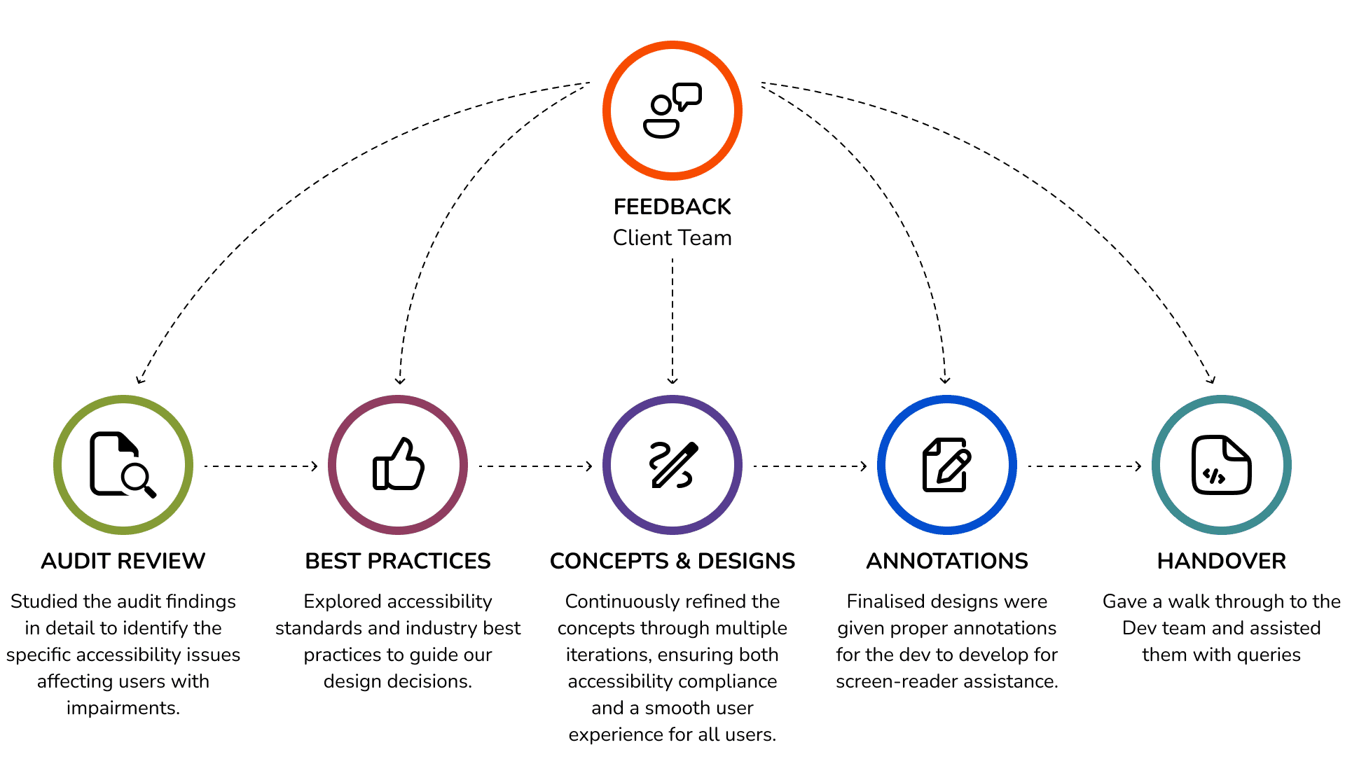
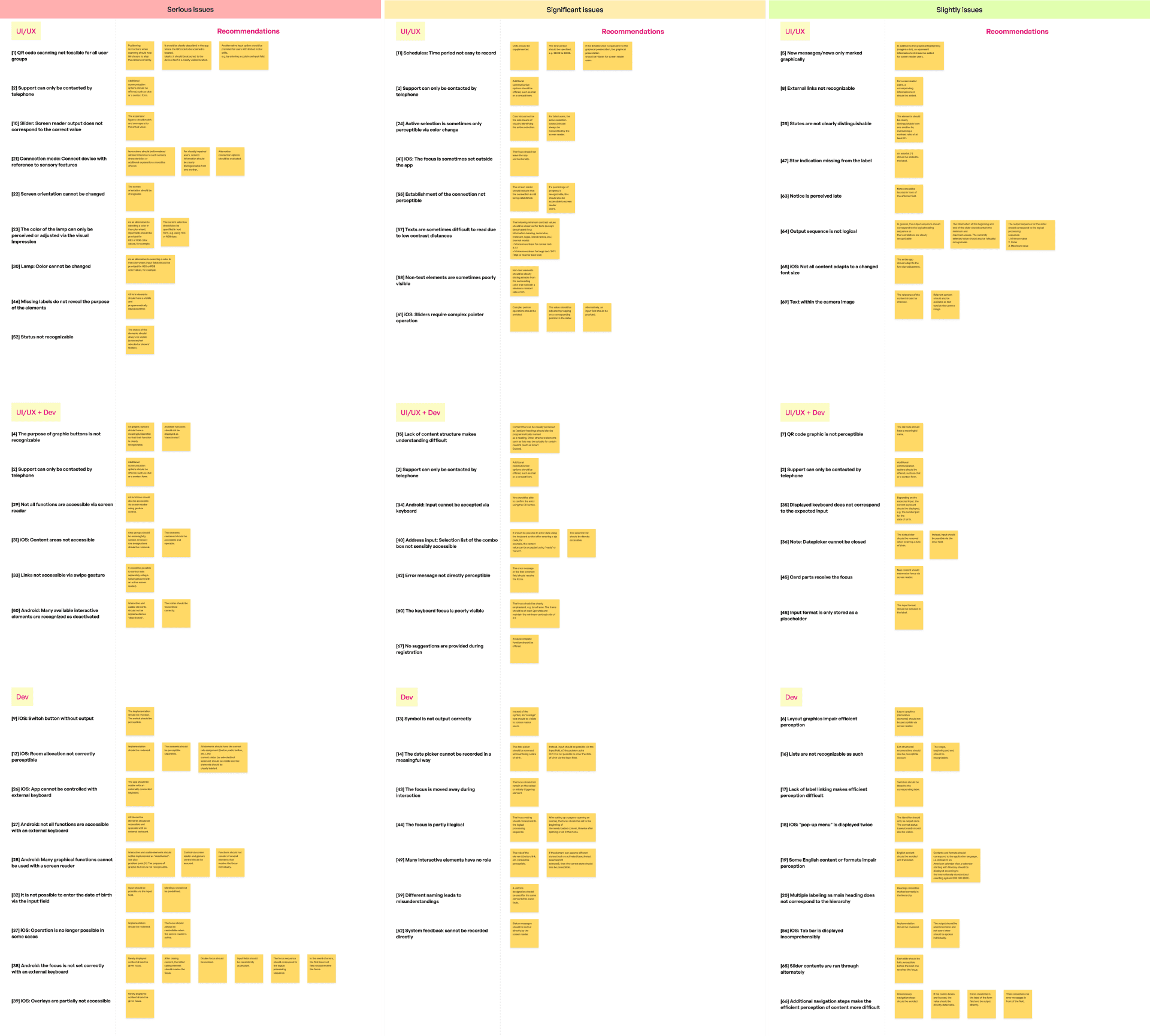
Analysing Audit Document
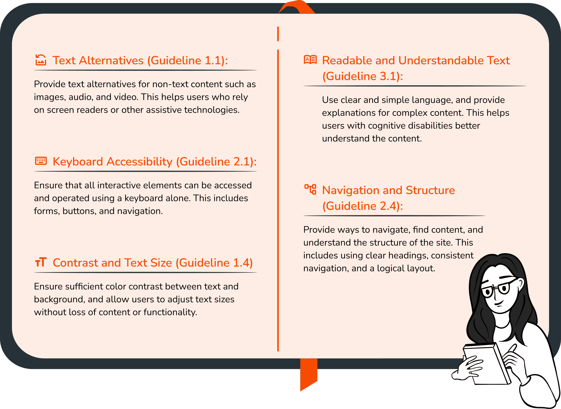
Key WCAG Guidelines and Success Criteria
Refine and improve Accessibility
After the audit review, I gathered the screens with identified issues and began the iteration process, keeping the WCAG guidelines in mind.
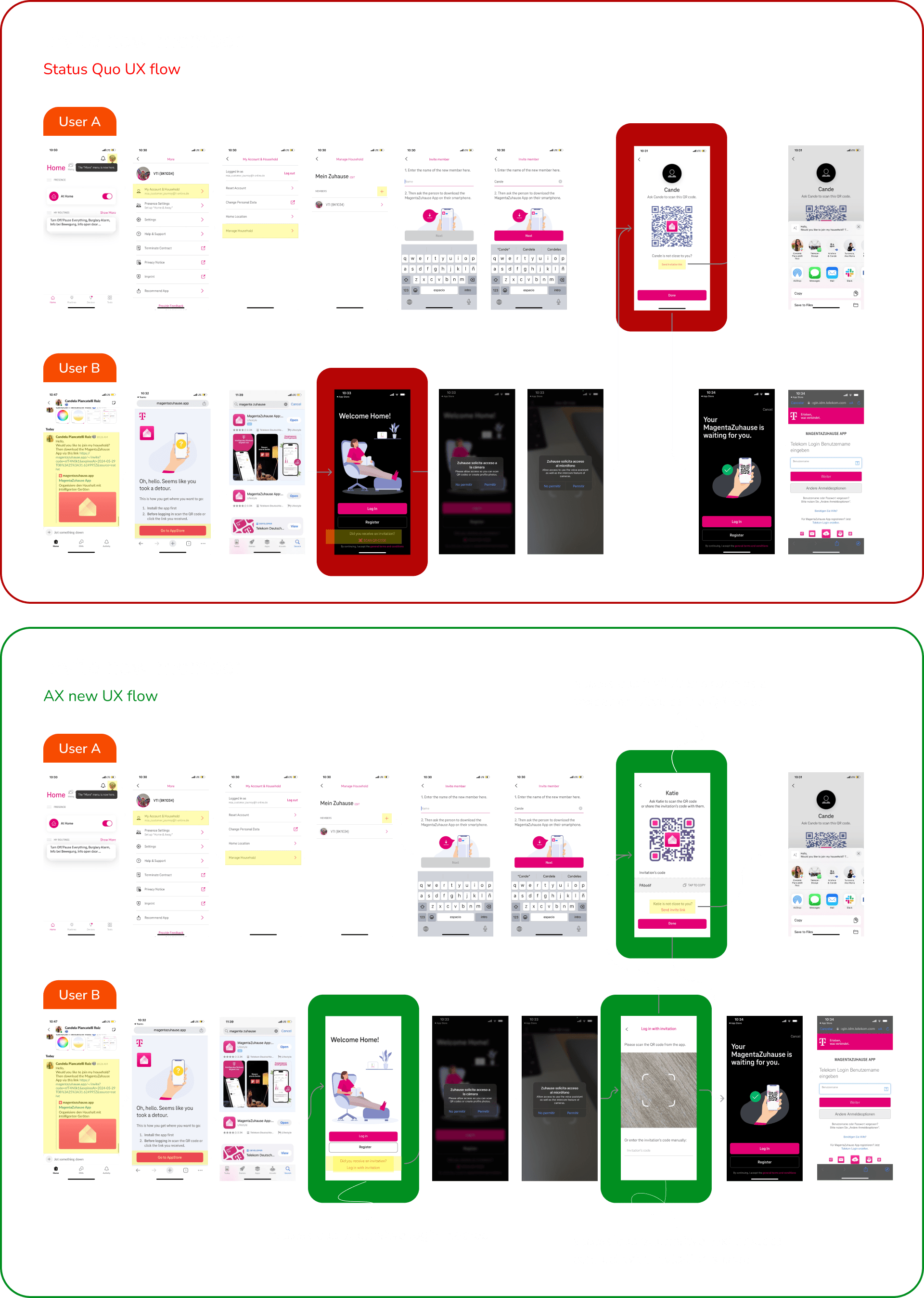
1. QR Code scanner not feasible for all users
After discussing the issue with the product team, I began working on an achievable solution. By adding an alternate login/invite method, users can manually add entries, which also improves compatibility with screen readers.
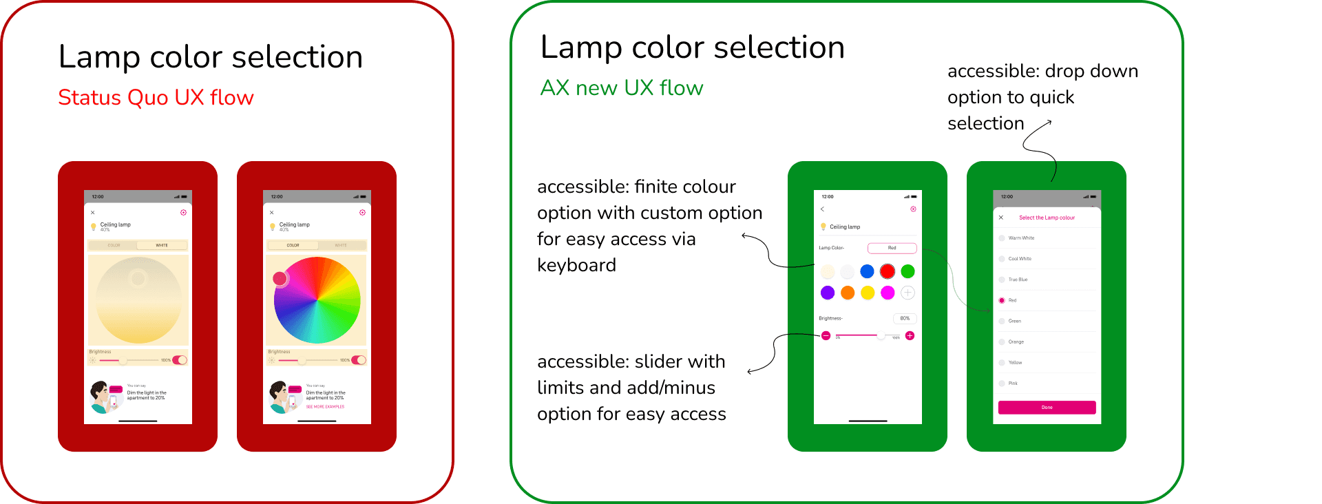
2. The color of the lamp can only be perceived or adjusted via the visual impression
3. Sliders require complex pointer operation
I focused on creating solutions that not only make tasks simpler to perform but are also compatible with screen readers. I researched best practices for both color selection and slider design.
I carefully considered each design decision with all user bases in mind, aiming for a solution that is straightforward and accessible for screen readers while aligning with the overall design language
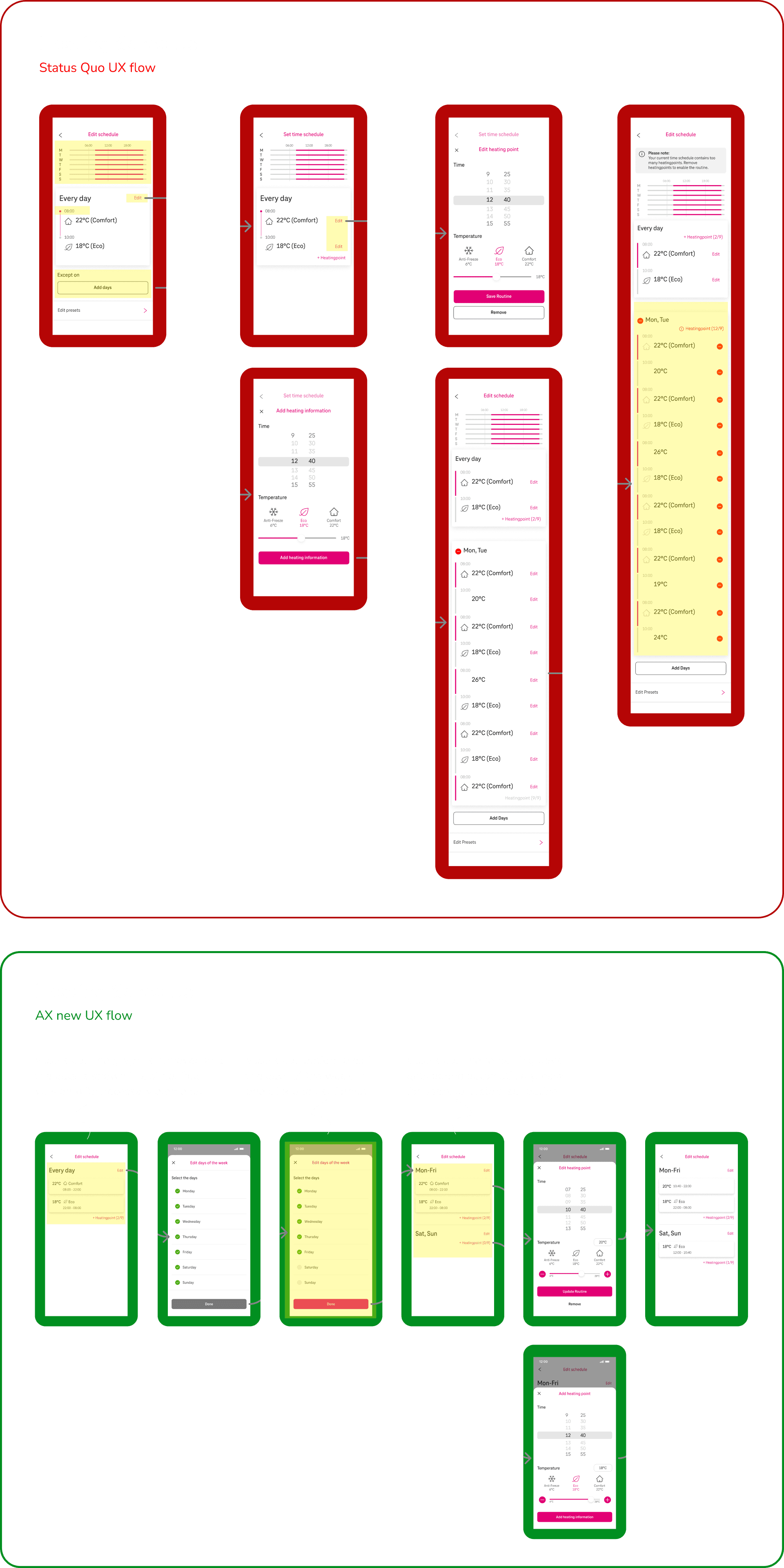
4. Schedules: Time period not easy to record
The existing flow for this section was complicated, with a disorganized structure and missing key information, which led to confusion.
My primary goal was to streamline the flow through multiple iterations, retaining only relevant information while readjusting familiar screens to ensure they were accessible for screen readers
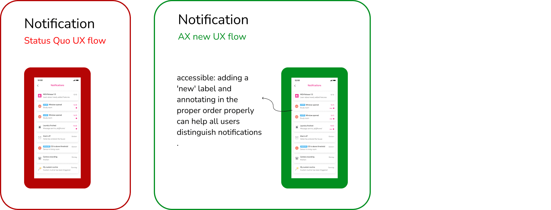
5. New messages/news only marked graphically
The issue with the screen was that the only indicator for a new notification was a visual highlight, which is not accessible to all users. I improved accessibility by adding a simple label and establishing a proper annotation order for screen reader.
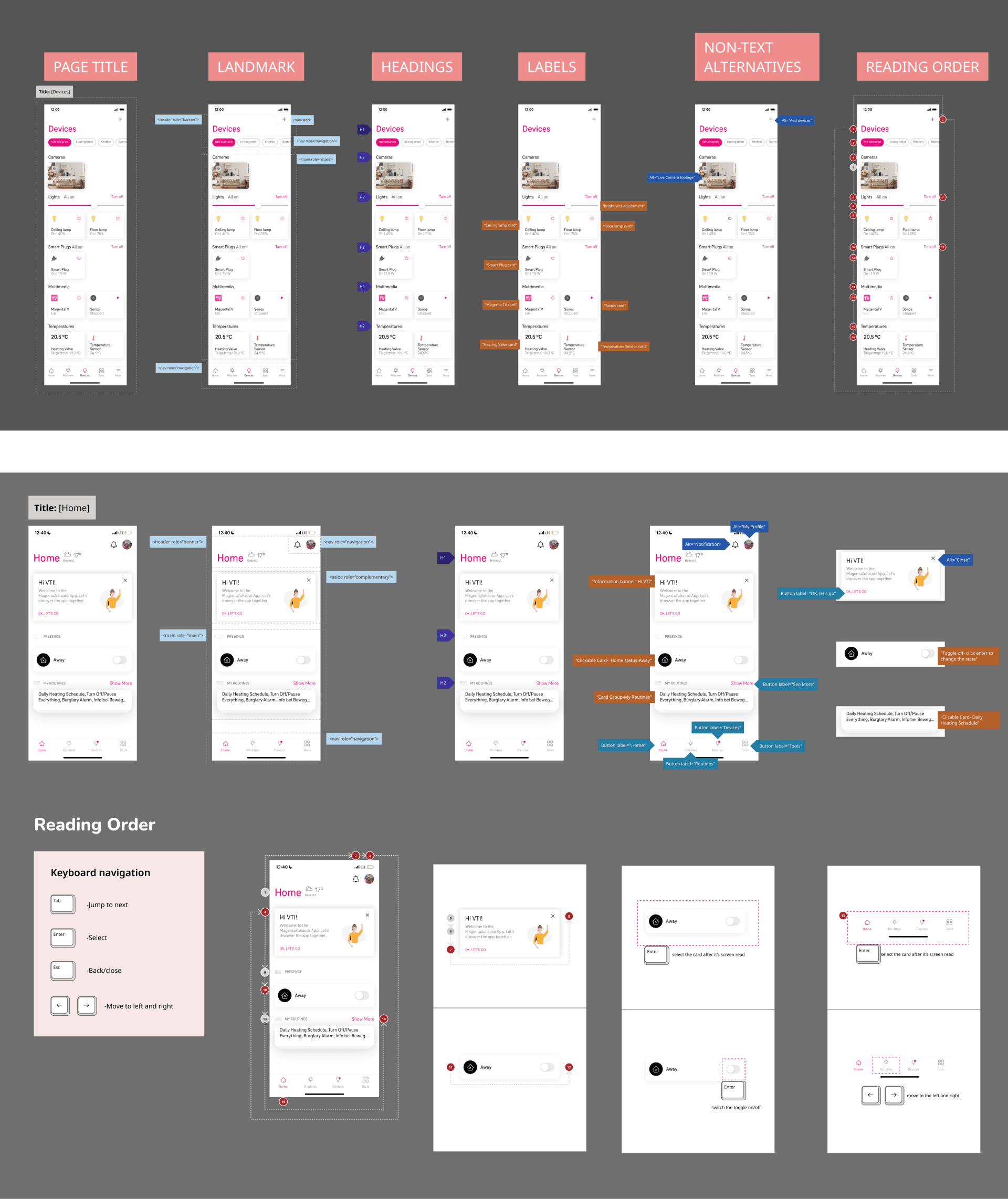
Enhancing Screen Reader Accessibility
Reflection
Empathizing with users is crucial for a product designer, and this project tested that at every step. I learned to keep all users in mind while designing, and studying accessibility revealed user pain points and struggles I hadn’t previously considered or fully understood. This project exposed me to an important and often overlooked aspect of design.
Throughout the redesign process, I was compelled to iterating on designs that would be accessible to all users. I dedicated time to brainstorming concepts and discussing potential solutions with the client. Eventually, I focused on simpler solutions that would pass the accessibility test while also aligning with the client’s business goals and remaining feasible for development.
 You made it till the end of the case-study!
More Projects